WORKS FOR THE GOOD
Client: The Brand MVMT
Service: Visual Identity
Welcome to an enigmatic world of our own imagining. Our studio is represented by a timeless aesthetic created through a craftsman’s hands with a dreamer’s vision. This visual identity system overflows with ambiguous details; characters in a narrative where everything is designed to represent something.
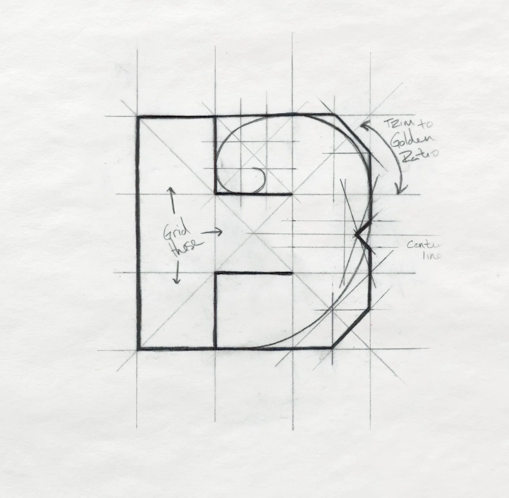
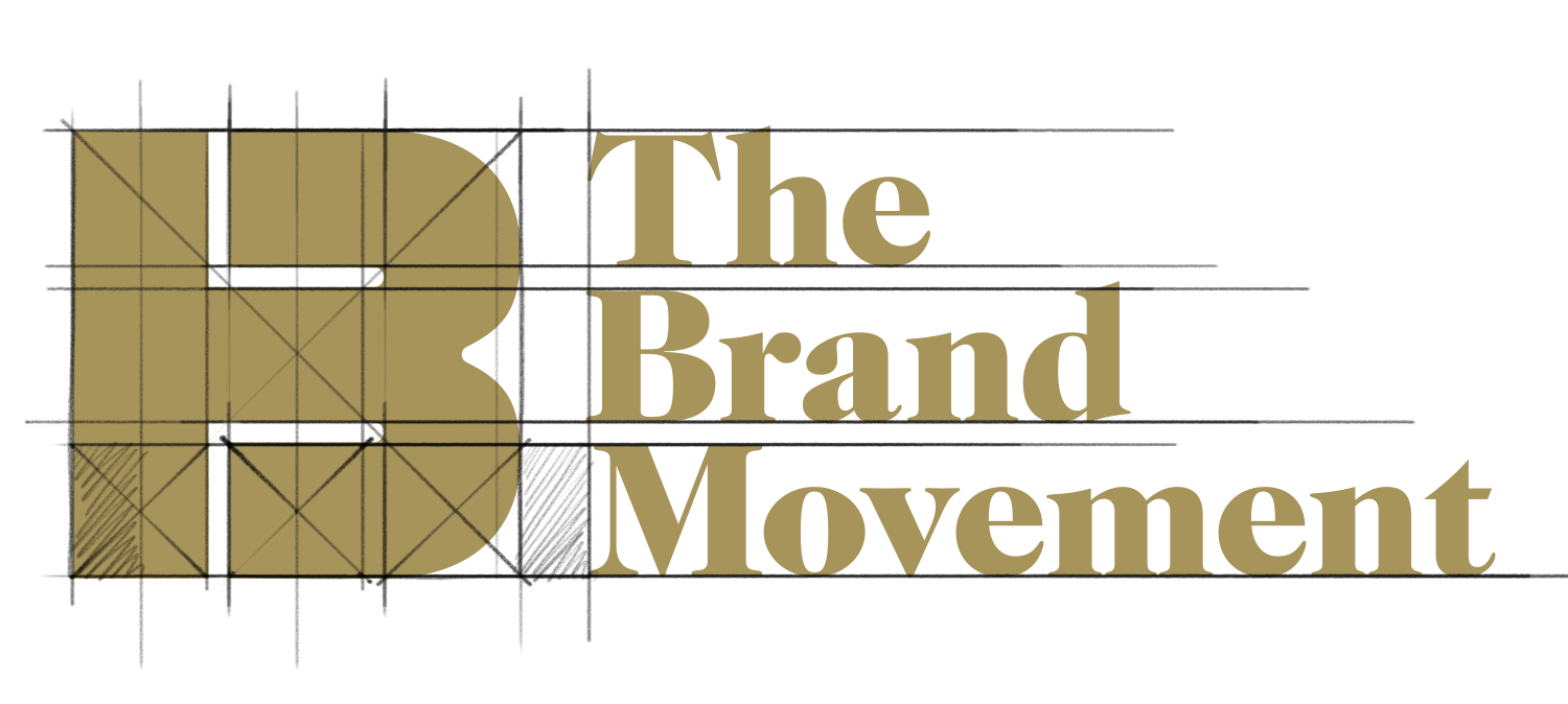
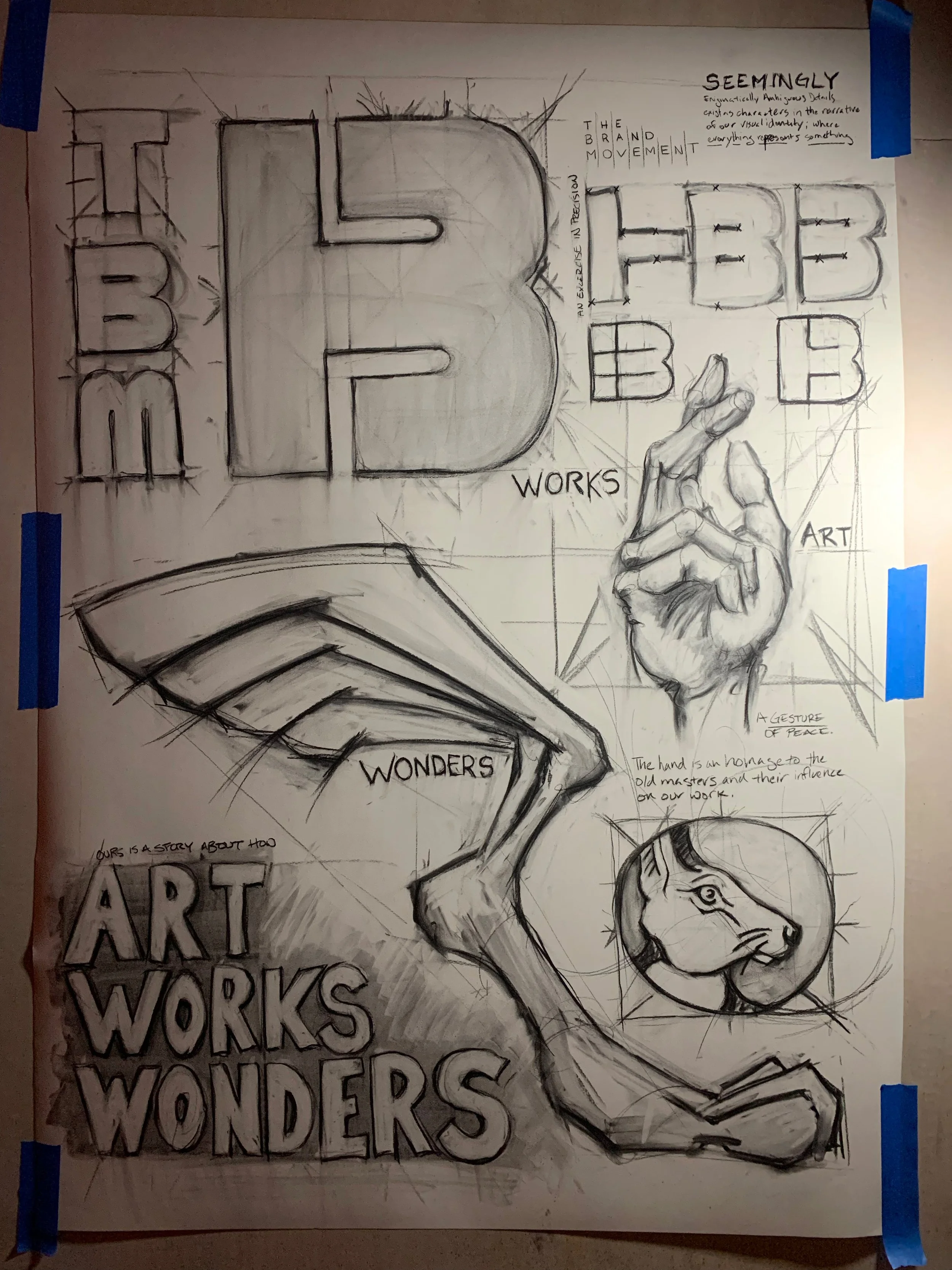
The ‘B’ is a combination of three letterforms contained within a single shape and delineated by two symmetrical negative spaces. The result is a simple but significant foundation for the entirety of our visual identity system.
The geometric harmony of this exercise in precision establishes a unique gestalt; the grid based construction prioritizes balance, symmetry and communicative function.
/ logo /


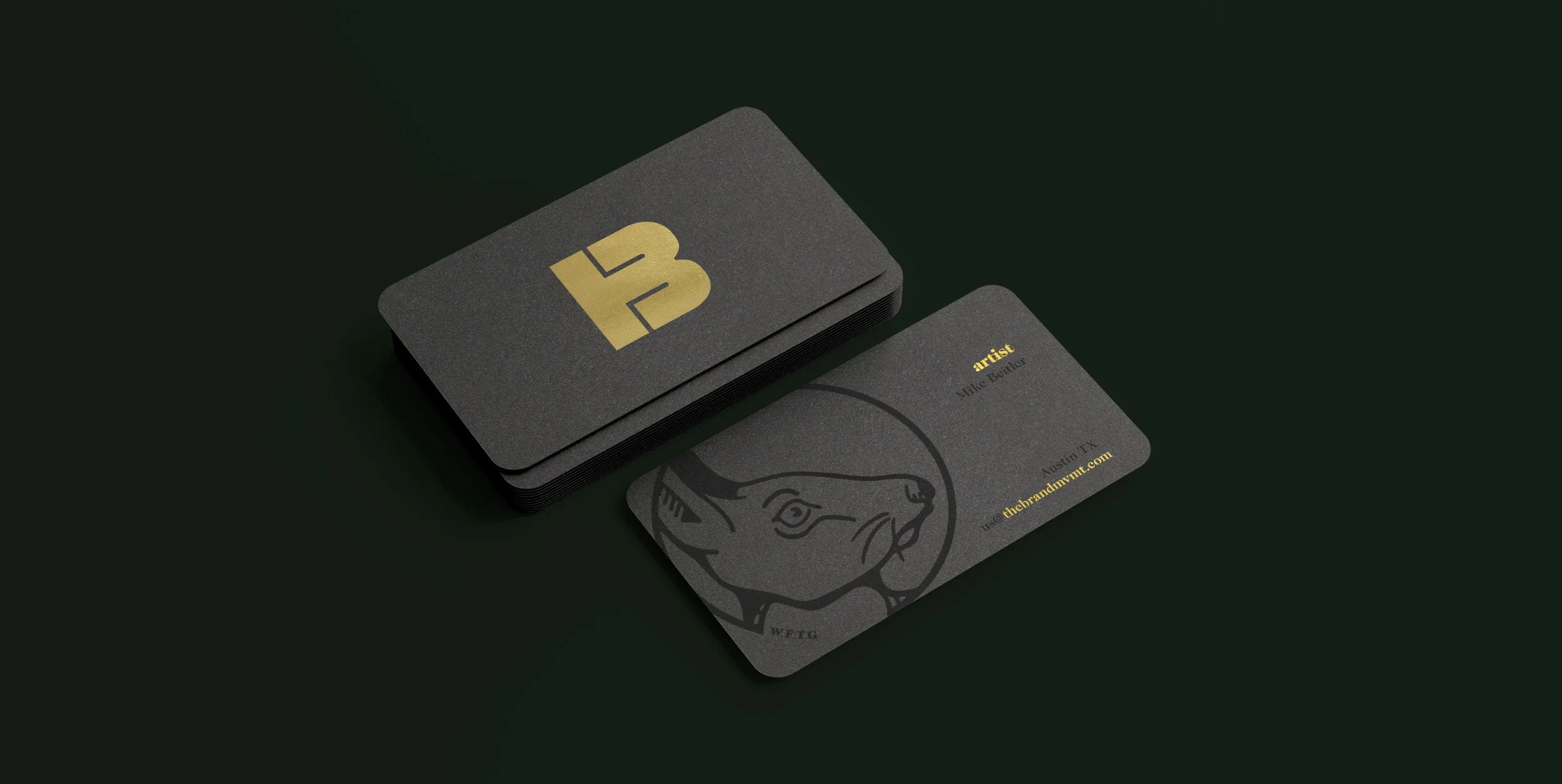
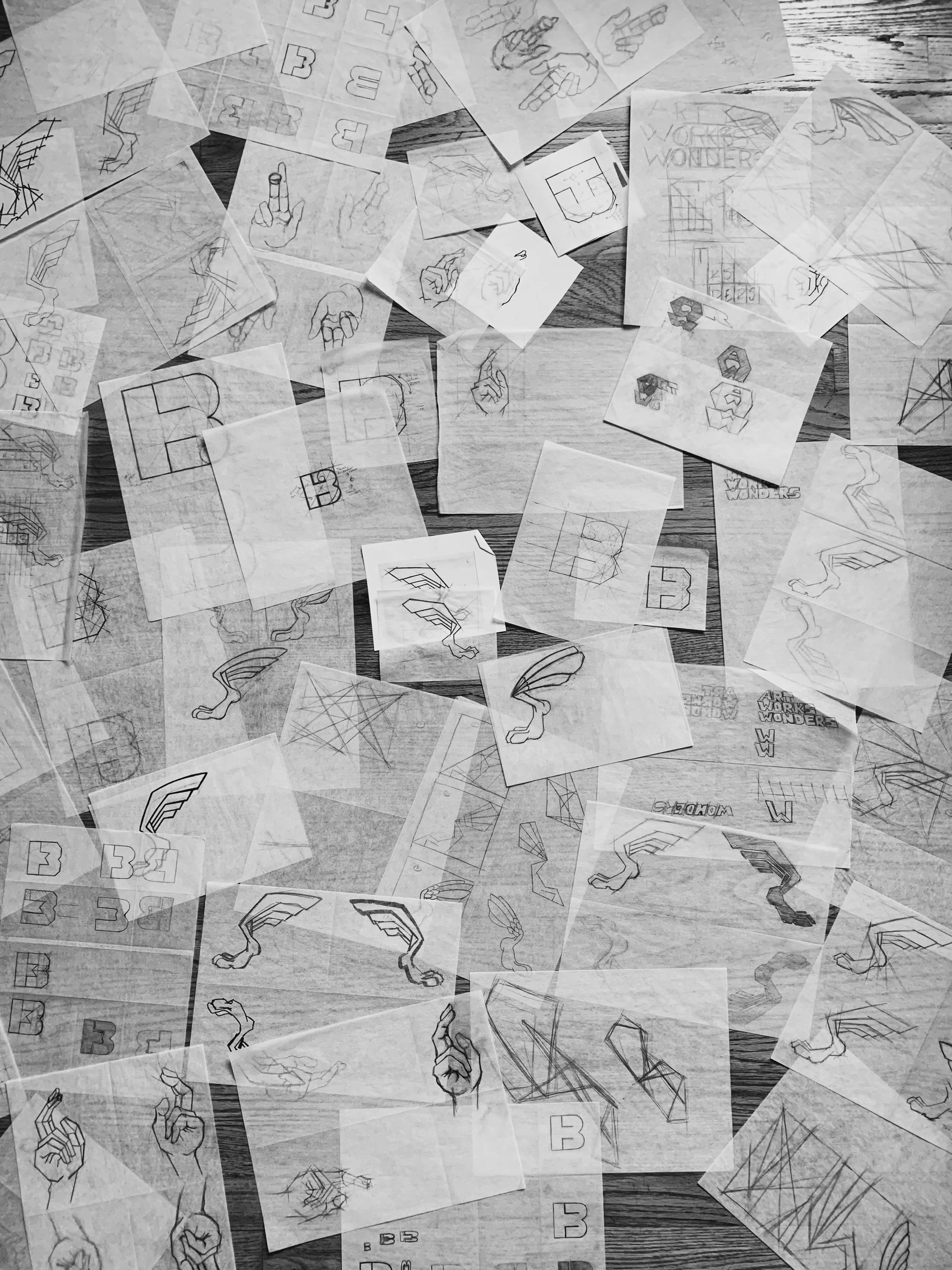
Our visual identity system is based on a foundation of precision established by the Brand Movement B, but its companions are free to wander into a more fluid and illustrative style.
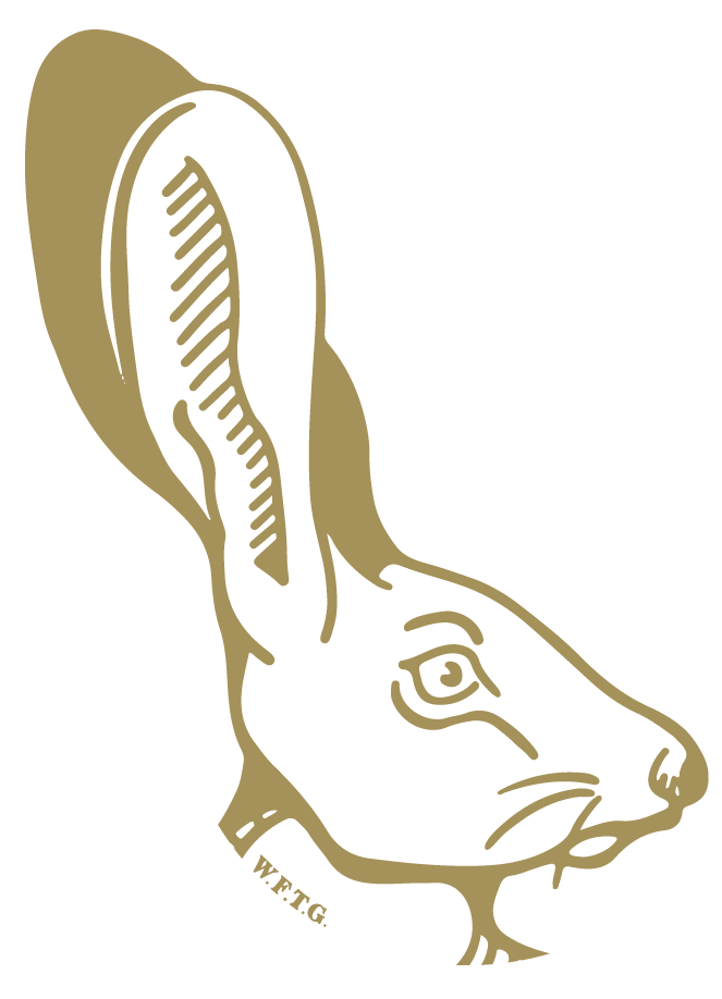

The Wonders Foot leaps with the elegance of flight. A winged tail fin steers this symbol of strength as it emerges as a mechanism for the propulsion of imagination.
/ symbol /

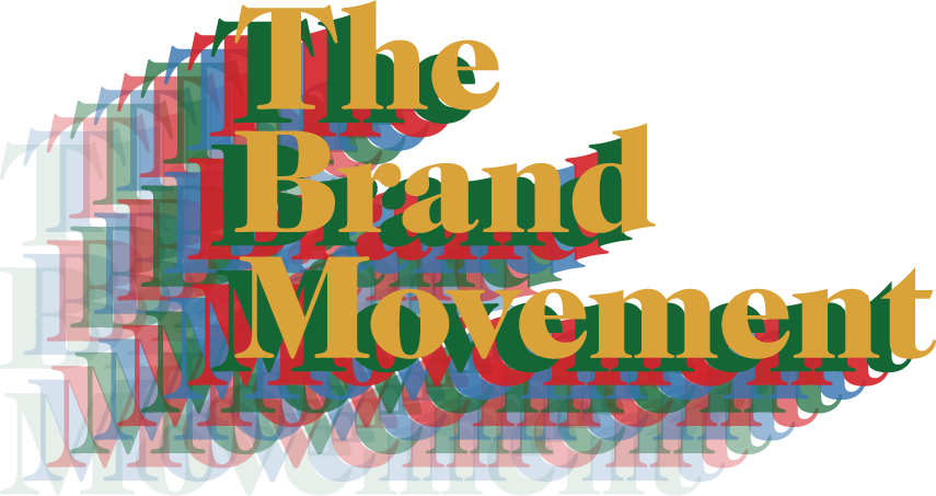
Our winged foot turns to gold in reflection and wonder as colors take flight. Black and bronze lay the steadfast groundwork of our palette, as the secondary colors go as far as our imaginations will take them.
/ color palette /

The Renaissance masters used this gesture in their work as a symbol of peace and a sign of blessing. It’s figurative nature not only represents the art we create; it serves as a reminder of our faith, our past, and our hope for the future.
/ symbol /

/ typography /
